Friday, September 23, 2011

Walgreens' Charity Check-In Special

Foursquare check-in specials are old news. Don't get me wrong, I love extra savings etc. that I often get from Foursquare specials, but I rarely see anything new or creative with their usage. Until today.

I had to stop at Walgreens over lunch to pick up a prescription and checked-in. I'm pretty terrible at remembering to check-in at places I run errands at, but today I remembered and was pleasantly surprised by the Foursquare special Walgreens was running.

My check-in just got someone needy a free flu shot voucher. Nice. Granted, there's no way to make sure that Walgreens follows through, but it still made me feel good about it. In a way it was nicer than getting something free, especially if it's something random I didn't really want in the first place.

Kudos Walgreens and a great new usage of the Foursquare Check-In Special!

Tuesday, June 28, 2011

Obama Continues Great Online Campaign Strategies

It's no secret that in the 2008 presidential election broke some records. One of them was the amount of grass roots fund raising and social media campaigning that Obama's campaign pioneered. Its success was, no doubt, a huge factor in his successful run for president.

Since 2008, politicians from the local to the national level have embraced social media and online marketing with the same fervor. You would now be a fool to run for even local office without an active and relevant Twitter account and Facebook page. Which brings us the 2012 presidential election and an interesting question:

How is Obama going to top that?

More specifically, now that every Republican nominee will use similar tactics, how is Obama's campaign going to stand out as different? His unique, cutting edge way of campaigning was such a large part of how he got into office and raised millions of dollars in $5 increments, one wonders how he'll top that. How he'll continue to get that kind of attention and support now that the idealist 'Hope' fervor and marketing differentiation that helped carry his first campaign is gone.

I was surprised and interested to see one of his new tactics emerge already:

Donate for a chance to dine with the president.

How cool is that? For any amount of donation, you can put your name in the hat to dine with the President. Its a standard sweepstakes, but twisted such that it fits campaign goals.

I find this to be a great tactic for a few reasons. First, if you're a liberal and an Obama fan it's your chance to schmooze with the President, get your ideas heard first hand like the top end campaign donors do—but at a much more affordable price. Even if you're an independent, someone not sure if they're going to vote for Obama let alone donate, it still seems to be a tempting offer. For $5 I can see a few otherwise non-donors dropping a few bucks for the chance to be heard first hand by the President. And finally, it's just pretty cool to meet the President, even if you don't agree with his politics. Tack the shear fact that, love him or hate him, Obama will go down in history books for being the first black President of the U.S. and it's quite an offer.

What do you think? Is a tactic like this going to up the amount of donations to the campaign? Or is it just a cheesy ploy?

Thursday, June 16, 2011

Time Magazine Reaches Out ... To Gamers?

Time Magazine is doing an interesting cross promotion with video game Call of Duty: Modern Warfare 3 by lending it's iconic cover template for a faux cover claiming 'World Stands On The Brink' while Wall Street smolders in the background. Time apparently even helped art direct the cover.

Time says that it's involved in the cross promotion in order to reach a new demographic of customers, while critics have a hard time seeing it really reach gamers and in the meantime it dilutes the brand image. I think Time isn't far off in how their trying to reach a new demographic—the usage of the magazine is appropriate and similar to how it's used in say, product placement in a movie for example. I don't think this treatment necessarily dilutes the brand image any more than that would. If anything, it's reminding them of Time's iconic place in the realm of news magazines.

But there is a catch—if Time is looking for growth in magazine subscriptions and not just awareness we have a problem. Why? Because I don't think too many gamers are the types to buy paper news magazines. They're much more likely to get that news online and given the constant dialogue about the best way for newspapers and magazines will be able to monetize their online operations as print declines. But that's another story...

American Express's Social To Mainstream Media?

American Express is running an interesting commercial highlighting customer's tweets about how they spent their customer rewards. It's a fun, feel good campaign though I would have loved to see it even more a couple of years ago. American Express is not the first to do a campaign like this, but they are still relatively few and far between. I also thought this one was pretty well executed. Check it out:

Wednesday, June 15, 2011

Check In To Space

I had heard, in the infancy of Foursquare, that you could check in to outer space. I looked for it on my Foursquare app, thinking it might be one of those global check ins—because, you know, Earth is in space, right?—but I couldn't find it. Apparently I needed to be in a space ship—or a 7-Eleven.

Yep, you heard me. 7-Eleven is offering you the opportunity to check in to space at a 7-Eleven store. And they're giving you the opportunity to win a space experience! Okay, well a Zero-gravity flight at any rate. You're more apt to win free tickets to the movie Super 8, for which they are offering this cross promotion.

Yes, it's a bit hokey, but fun nonetheless. I'd stop by a 7-Eleven just to have that on my Foursquare history, would you?

Monday, June 13, 2011

Everything's Better With Bacon

If you work in advertising or design you're bound to be familiar with 'greek' copy. It's that nonsensical string of words designers use as placeholder text to show where copy would go before the it's actually written. It's meant to be there as filler so one does not get caught up in the specifics of what's being said and can concentrate on looking at the overall design and concept. The typical stuff goes something like this:
Lorem ipsum dolor sit amet, consectetur adipscing elit, sed diam nonnumy eiusmod tempor incidunt ut labore et dolore magna aliquam erat volupat. Ut enim ad minimum veniam, quis nostrud exercitation ullamcorper suscipit lab oris nisi ut aliquip ex ea commodo consequat.
Surprisingly, that copy is actually broken latin that translate roughly into Cicero's On the Boundaries of Goods and Evils. Not that anyone actually reads it. There are dozens on Lorem Ipsum generator sites on the web that will give you a whatever amount of the placeholder text for you to copy and paste into your layouts.

Enter the Bacon Ipsum Generator. Essentially it does the same thing as a traditional Lorem Ipsum generators, but it uses only cuts of meat for the words. So instead of the copy show above, you might get something more like this:
Boudin sirloin pastrami, tenderloin meatloaf bresaola brisket pig meatball tongue. Biltong bresaola ham hock, tongue tri-tip turkey brisket meatball meatloaf jerky corned beef drumstick. Flank pork tri-tip, jowl tongue shankle short loin hamburger headcheese strip steak venison boudin ribeye andouille t-bone.
How fun is that? We've all seen Lorem ipsum enough times to recite the first few lines from memory (I'm not joking) so a little shake up of the old routine is more than welcome—especially when it includes bacon. Yum!

Friday, June 10, 2011

Cool QR Code Ads

The advertising world is becoming overrun with QR codes and they are usually used pretty poorly. Love them or hate them, QR codes do sometimes serve a valuable purpose—if your audience is technologically savvy smart phone users and if you want to drive them to a website that might be cumbersome to type into those smart phones. Most QR code uses don't fit those criteria, most of the time it seems like ads with QR codes fall into the "so we can say we did it" reasoning.
But if you're going to go that route, at least make the ad about the QR code. And make it cool. Like these fun QR code ads I ran across on Ads of the World a couple days ago. Otherwise you easily fall into the realm of marketers that have suddenly discovered they can scan ugly bar codes with their phones. How novel.


Wednesday, June 8, 2011

Creative PSA Turned Viral Ad

The Alamo Theater in Austin created quite and internet stir this week as one of it's in-house PSA announcements went viral on the web. The local movie theater chain apparently has a history of amusing PSA announcements, reminding patrons to be respectful of others in the theater by not using their phones or talking loudly. One set even featured the former governor of Texas!

Their latest home grown effort, however, has captured the web since it features a rather amusing rant from a patron kicked out of their theater for texting during a movie.

At one point in the rant, the offender notes that she was not aware that she could not text in the theater and that she has 'texted in ALL the other movie theaters in Austin and no one ever gave a @#&!' which offers up the question—why aren't more theaters kicking people out for this? Clearly, some people don't realize texting during a movie is just as taboo as chatting on your cellphone and based on the popularity of this PSA, more patrons prefer their movies sans texters. Honestly, this PSA makes me want to go to an Alamo movie theater and I'd gladly patronize any other theater that takes an equally tough stance on texters and talkers. If you can't be separated from your phone for a couple hours (besides potentially seeking help for that), just wait for the DVD please.

Tuesday, June 7, 2011

Is Audi Copying Chrysler?

It seems a tad hard to believe, but a new video (no advertisement, according to Audi spokespeople) airing in Europe has a pretty distinct inspirational vibe from the recent 'Imported From Detroit' Chrysler Super Bowl commercial.


I came across this European ad because Eminem is actually suing Audi for illegal use of his copyrighted music (if you notice, a minimally revised version of 8 Mile guitar tracks play in the background of the Audi commercial), not because it's being accused as a rip off (though it kind of is). Honestly, if they'd not used Eminem's guitar track it would feel less like a rip off and they wouldn't be in legal hot water right now.

On that note, I have to ask both Audi and their agency, 'What were you thinking?' Audi's response has been that this is not an advertisement and it's not running in the US (and that this doesn't involve Audi of America). Other than the target audience perhaps not realizing it's the rip off that it is, how is that helping your case? You used a well known music track illegally, and semi-copied rival car company's Super Bowl commercial. Shame on Audi and shame on their agency (I'm not actually sure who produced this).

On the flip side, major kudos to Chrysler for producing such a kick ass spot that a luxury German brand is imitating it.

Here's the Chrysler ad if you want to compare:

Wednesday, June 1, 2011

Emotionally Intelligent Signage

Big blue monsters holding stop signs are the new wave of traffic signage? In an intriguing new campaign to urge drivers to slow down, a few municipalities are trying a different tactic—traffic signs designed by children.

The signs are intended to emotionally reach drivers to remind them that their speed affects child safety and to break up the monotony of the signs drivers typically see. The idea is to encourage empathy on the part of the viewer, make them feel a little uneasy about going fast and hopefully get them to slow down and drive safer.

The idea was pioneered in Newton, Massachusetts back in 2008, where it was a hit, and has now expanded into Bayside, Wisconsin. It's an interesting approach and much better than the other 'slow down' campaign we blogged about last year. We'll have to see how well it works.


Thursday, April 21, 2011

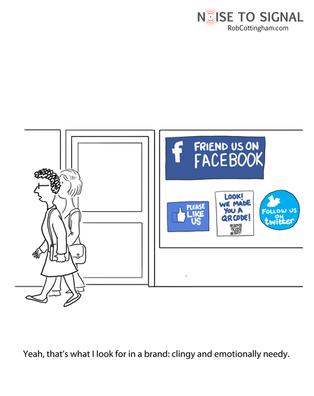
Don't Be A Clingy Brand

This cartoon came to my attention a couple weeks ago, but I didn't get around to posting it. Having just been asked, yet again, to 'like' another brand on Facebook I remembered I wanted to share.


Facebook pages and Twitter have been around awhile, but the past six months have seen and exponential growth in the number of brands now officially on both social networking sites and trying to use them. Granted, there is some cool stuff going on in this realm, and often following a brand you really like can be beneficial, but the constant requests to 'Like' or 'Follow' your brand are starting to sound like that classmate from high school, whom you barely remember, that keeps trying to 'Friend' you on Facebook. It starts to look a little pathetic.

Wednesday, April 13, 2011

Adobe Offers CS5.5 and a New Subscription Service

If you're a designer on Twitter, it was hard to miss the promoted tweets from @CreativeSuite on Monday, announcing new CS5.5. Say what? That's right CS5.5. Apparently upgrades every other year were not enough, so now there's a 'half' upgrade each year in order to 'keep creatives at the forefront of technology'—oh, and to make some more money too. Did we mention that part?

Pricing
Adobe's new CS5.5 is at least a cheaper upgrade than it is to a 'full' version. The CS5.5 Design Premium is $399, if you're upgrading from CS4 it's $650. I can't remember what the price was to upgrade from CS4 to CS5 was, but I think it was around $500—maybe $600. (If you have better info on that number, please leave a comment or email me, thanks!) CS updates about every 1 1/2 years, so if you buy every version, you previously would have spent about $330-$400 per year, now you'd spend more like $500-$600 per year (assuming CS6 still releases less than a year from now). This isn't going to be detrimental to agencies, most small and mid-sized agencies (I'm not as sure about the big ones) don't update every version as it is. The people this is going to hurt is the printers—they need to have the latest and greatest because at least one of their clients is going to upgrade when the newest CS version comes out and they'll expect their printer to be compatible. They'll pretty much have to spend the extra dough.

But fear not, Adobe now has a subscription service! That should be more economical, no?

Subscriptions
Adobe's new subscription services guarantee you the latest software at no extra charge—as long as your subscription remains active. My first thought was 'Finally! A way for designers to have affordable access to professional programs on their personal computers too!' It's a beautiful idea in theory—not so much when you crunch the numbers.


Adobe's subscriptions prices and plans are as follows:

There are two plans, the yearly plan, which requires a one year contract at a time, or the month-to-month plan. Is it just me or are these ridiculously overpriced?

Let's stick with the Creative Suite Design Premium (CSDP) package I discussed at the beginning of the post as our reference point. While the initial upstart cost for CSDP is $1900, the upgrades are like $400-$700 depending on how many generations you skipped in between, but let's just say you like to be on the cutting edge and want the latest and greatest software when it comes out. If Adobe came out with a new version every year, your upgrade costs would be $400 per year. On the one year subscription plan you're paying  $1140 per year. WHOA. That's $740 more per year.

But wait, you say, you're not including that hefty $1900 initial software investment—well, let's crunch those numbers shall we? Let's take a three year period where you purchase the software and update twice (that would be assuming a new release once a year—more than that is just overkill) That's $1900+$400+$400=$2700. Over that same three year period, you'd spend $3420 on the subscription service and your access to the program ceases as soon as you're not paying anymore! How is that economical? I can see it only if you didn't own CS originally and you knew you'd only use if for one year or if you couldn't afford the initial start up cost—but seriously, at these prices, it's well worth it to ante up initially and own the software.

The month-to-month subscription is a little different. It allows you be a little more flexible. Maybe you're a sporadic freelancer who just needs the programs from time to time. The trouble is, at least for the standard design programs, it's still not cost effective unless subscribing only a couple of months a year, though I can see the month-to-month subscriptions useful when you need one program, like Premiere or AfterEffects, for just one short term project. The downside there is pretty much all of Adobe's products have a high learning curve so it's going to take you awhile to use them well anyway. Then once you're not subscribing, my guess is you no longer can open those files—which could be highly annoying.

I see extremely little use for Adobe's new subscription program. It's an interesting idea for design software, but as it stands right now, there is little financial incentive to go that route. Meanwhile, the 'half' upgrade software seems little more than a blatant attempt to suck more money from designers.

Am I missing something here? What do you think?

Tuesday, April 12, 2011

Turn Your House Into A Giant Billboard

A company called Adzookie, a web advertising company, is offering to pay your mortgage if they can paint your house into a giant billboard. The contract goes from 3 months up to a year at which point they'll paint your house back to it's original colors. Kind of a crazy idea, but not a bad gig for the homeowner if you don't mind a temporarily purple and yellow house. Free mortgage for up to a year and a free paint job at the end of it? Not to mention it could be a godsend for many of the homeowners struggling to make their mortgage payments.


The company is looking for houses in California and as of last week had received over 1,000 applicants. It's definitely not for everyone, but it sure beats foreclosure.

Would you paint your house as a giant billboard for Adzookie?

Thursday, February 10, 2011

The Anti Social Super Bowl?

Did the Super Bowl commercial lack social media components this year? According to this article from Ad Age, yes, they did. With the number of people with smart phones these days and the power of social media marketing it is surprising there weren't ANY integrated campaigns.

Granted, I learned from the Super Bowl of Social Media voting site that the Doritos and Pepsi Max spots were consumer generated concepts that the brands then produced for the Super Bowl. I had no idea. There was no press that I knew of and no indication prior to the spots airing that they were user generated. It does explain the fragmentation and appearance of a lack of a unified campaign. Honestly, they were some of my least favorite since they seemed contrived with too much cheap humor. Some of them actually offended my parents and I found them rather yawn-worthy. Haven't we seen that same crap in the last five years of Super Bowls? I'm actually more sad to find out those were user generated—there's got to be some better ideas out there.


Ian Schafer's Ad Age article cites some great examples of what could have been done with the campaigns that ran to make them more social. He chides Chrysler, Motorola and Coke for not reaping clear tie-ins that would have worked centrally with their Super Bowl campaigns. I loved the 'Imported from Detroit' ad from Chrysler, but why didn't Chrysler tie that in to some charitable cause for Detroit? It would have to be the right charity, but it would have been brilliant. You have millions watching, enraptured by the commercial, feeling the American Pride for Detroit—the right charitable tie in would have given Chrysler the image of a car company that cares as much about its city as it does about selling cars.


Schafer argues that incorporating social media would have given these campaigns legs beyond the Bowl. As it is, many of the commercials will continue airing for months, but I think he has a point. The social aspect would give you legs and interaction beyond the television. And isn't that what all brands are trying to do these days?

I wasn't watching the game, poised with my iPhone, but it was just across the room. I think I would have engaged if I'd been asked. Would you? Did you think the Super Bowl was lacking in social media aspects?

Monday, February 7, 2011

Super Bowl Ads: Celebrities A-Plenty, Hits A-Few

There were a lot of celebrities in this year's set of Super Bowl ads, from Joan Rivers for Go Daddy, to P. Diddy for Mercedes, to the Osbourne's and Justin Bieber for Best Buy, but few of them hit a home run. Honestly, I think my favorite commercial was the pre-released VW ad (sans celebrity) that I blogged about last Friday. You had to have a pretty good knowledge of pop culture to understand all of the references in the commercials and I happened to be watching the game with my parents, who understood very few of them. As the New York Times stated:
To fully appreciate the commercials, it helped to be at least passingly familiar with “Almost Famous,” “Back to the Future,” Roseanne Barr, Busby Berkeley, Justin Bieber, Adrien Brody, David Bowie, Diddy, the “Dogs Playing Poker” paintings, Howdy Doody, early video games, Thomas Edison and Eminem (who turned up in two spots, for Chrysler and Lipton Brisk).
There were also quite a few car commercials during last night's game, from the P. Diddy Mercedes commercial celebrating it's history to the tune of Janis Joplin's Mercedes Benz. The spot was pretty good, but P. Diddy seemed like a random, unnecessary add-on and distraction from the rest of the spot. Meanwhile, Audi targeted Mercedes as the confines of old luxury complete with a cameo from Kenny G and a stuffed Dodo bird.

In the realm of soda advertising, a few of the plethora of Pepsi Max commercials managed to completely offend my parents. Even I found them in rather poor taste. Buying that many Super Bowl spots doesn't help your brand if they're a total turn off. Coca Cola's 'Open Happiness' commercials were good, though underwhelming compared to some of their classics like the Happiness Factory from a few years ago.

Below are the best of the lot (in my humble opinion):

Volkswagon
I blogged about this one on Friday, but it's my favorite so it's getting included again.


Motorola
Motorola took a stab at Apple with it's 'Empower the People' 1984 reminiscent spot to introduce its rival to the iPad. Only this campaign is turning the tables to make Apple the drone-creating big brother company. (Check out the original Apple 1984 commercial here.)


Bridgestone
Okay, so the Bridgestone beaver ad is a little cliche and a little reminiscent of the Geico squirrel ad from years ago, but it still made me smile.


Chrysler
The best car commercial of the lot, in my opinion, and one of the only celebrity uses that seemed fitting, was Chrysler's 'Imported from Detroit'. There was something about this commercial that reminded you of the American Pride that Detroit used to represent. Something that reminded you that Detroit is part of our country and it's survival is important to the rest of the country too. It was a refreshing car commercial and Eminem, while not necessary for the spot's impact, exemplified working class Detroit and money at the same time, so at least his placement made sense and had some meaning.

Friday, February 4, 2011

The Pre-Super Bowl Super Bowl Ad Release

Has Volkswagen set a new trend? The Pre-Super Bowl Super Bowl ad release on the internet? Volkswagen 'leaked' its Super Bowl ad for this year a few days early. Personally, I think that's a trend that's going to catch on. I mean, millions of people watch the Super Bowl. Most people watch it for the game and continue to enjoy the usually high quality ads that accompany the game, as well as a few people that just watch it for the ads.

The trouble is, when watching 3+ hours of television, often at a party or bar, are you really going to have your eyes glued to the TV the whole time? Of course not. Which is why, inevitably, you miss 'that really good' commercial because you ran into the kitchen for a beer or more chips or whatever, and have to wait until the following day (when they're all on YouTube) to catch up with the spot everyone is talking about. Why not release the ad early, to the internet crowd and have them drum up excitement for its airtime on game day? Think about how many people will mention to friends, 'Did you see the VW Darth Vader spot? It's so cute—watch for it!' Plenty.

Granted, some of the talk will dissipate if more and more brands pre-release, but it is a good way to make sure you're spot is seen and remembered. What do you think?

Check out Volkswagen's pre-released tiny Darth Vader spot below. It's pretty cute.

Tuesday, January 25, 2011

Starbucks Chooses Siren Over Recognized Name

Okay, I realize I'm committing the cardinal sin of blogging by being oh, about 2 weeks or so late to the punch, but I was blissfully lying on a beach sipping piña coladas when the Starbucks news broke and am only now really getting back into the swing of things. Apologies dear readers on being so delayed on such big logo redesign news!

If you haven't yet heard, and I don't know how that's possible, Starbucks dramatically changed it's logo—cutting out the words 'Starbucks Coffee' and using just the image of the siren in Starbucks green. I posted a few years ago about Starbucks' logo evolution with a link to an AdFreak article showing and discussing the various changes in the logo. My original post was sparked by a news story about a conservative group getting upset over Starbucks using their original logo—which has a more scandalous version of the siren their latest logo focuses in on.


People tend to be rather divided on their opinion of Starbucks new logo. My initial reaction was 'Why did they do that? Most people don't even notice the siren.' Not to mention those that noticed it in the past, weren't so thrilled with it's legs (or fins) wide open message (hence the premise for the old post). There was some email bantering about among the creatives at my agency when the news broke and amid the overall dislike of the logo, there were two main points that I agree with.

First, to many consumers, the name Starbucks and its typography in the green circle was as much, if not more so, the logo than the siren was. So eliminating the typography from the logo, while theoretically great for brand evolution, just doesn't seem to fit. The logo was developed internally at Starbucks, which could be some of the roadblock. I'm guessing the siren plays a much bigger part of their internal corporate identity than it does outside Starbucks' corporate walls. That's not to say the siren isn't identified with Starbucks identity, but it's just not was people remember and visualize when they think of the Starbucks logo in their head. Then again, maybe this decision was intended to change that perception.

Second, the siren by herself just doesn't hold her own. Okay, so Starbucks wanted an evolution of their logo for their 40th anniversary. They didn't want to go just Starbucks or Starbucks Coffee (the thought is this is because they plan to grow beyond coffee and continue to globalize—see the video below) so they went with the siren by herself. Some supporters of the logo point out that this is the epitome of a brand—when their identity can go completely visual with no type identifier. Think Apple or Nike. Starbucks kind of falls into that category, but not as well. It's not like people are not going to recognize the new mark, but it just doesn't have the same simplicity. The new logo should have an updated siren as well, especially considering the evolution of that part of the logo. Perhaps an updated siren with a simplification of the type (cut the words coffee?) for an eventual simplification to a logo only? Just a thought.

I don't think the new logo is going to hurt Starbucks. Indeed, I think most people have already forgotten about the redesign uproar, but I don't think it was quite the right move. It is rather uninspired and needs more simplification to really stand on it's own.

What do you think of the new Starbucks logo? Love it? Hate it?

*Also, check out this video from Starbucks introducing the new logo: