Wednesday, June 30, 2010

Map to the power of Quest?

When was the last time you used MapQuest? Anyone? I think the last time I ventured to that site was through a link on an out of date website. Any other time, I'm all about Google Maps. That's not to say Google Maps is perfect, it's not. Google has led me to the complete wrong location a couple of times, but in the past few years, regardless of Google Maps' mistakes it has swept the internet mapping market. I want to say the shift began when Google introduced Street View and continued as Google Maps was automatically included on iPhones and Blackberrys. Then came walking and biking directions, the ability to shift your route, automatically giving you alternate routes and times and the live traffic feed.


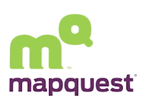
Well, MapQuest has finally revamped, a couple of years late, but they're trying nonetheless. They have a new logo and a revdesigned website. First off, the new logo is definitely an improvement. I like it, thought as mentioned in Brand New's review, I originally saw M to the Q, which I really liked, until the video showed me the little MQ creature thing. Now that's all I see and I kind of liked the other direction better. Oh well. The logo itself seems to be molded around being a good icon, like an iPhone or iPad icon, which is a little different, but smart approach. The new logo overall is secondary to how the MQ functions as an icon and all in all, much improved.

The new MapQuest website is also much improved, though the real question is if it can recapture some of Google Maps market share. The revamping makes me want to give it a shot again, but unless it proves to be significantly more accurate than Google Maps, a switch back is doubtful. While they've finally incorporated some of the perks of Google Maps, like traffic and street view (though Google's is on a larger scale). They've also copied a few other features like customizable printed maps. While MapQuest is touting some of it's features that Google doesn't have, like saving your own maps, they're relatively small things I don't see a huge amount of use for. The little icon buttons that show ATMs and Gas Stations are nice though—I can definitely see the use for that if I needed something like that on the go, however, I see that mostly useful for a phone app and other popular applications, like Siri, already have that covered. The biggest lack in the new design, is if they were going to copy so much of Google's features, they really should have worked in the walking, public transporation and biking directions that Google has. Honestly, I think those are one of Google's best features.

Overall, the website, logo and icon are nicely designed, but in terms of functionality, it's hard not to feel like MapQuest is trying desperately to play catch up to Google Maps. What do you think?

Thursday, June 24, 2010

Volvo's Strategy Eclipses Last Twilight Contest

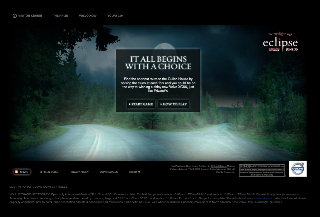
So Volvo running another contest to win a Volvo surrounding this summer's release of latest Twilight movie, Eclipse. They ran a similar contest last year with a series of puzzles, released systematically over time, that you needed to complete in order to win the Volvo. It was a fun idea and Volvo definitely made the puzzles sufficiently challenging. (Of course the internet gave you the answers to the earlier puzzles eventually.) You had to complete all of the earlier puzzles in order to have access to the final puzzle. The final puzzle was then a timed competition. The first person in each country (or continent, I don't remember which) won a new Volvo. The only problem was this high intensity Flash puzzle had technical issues like crazy (even when the server wasn't overwhelmed) and there wasn't nearly enough bandwidth for everyone trying to compete when the final puzzle went live. I don't think that 'first to complete' tactic worked well and cyberspace was filled with car-winning hopefuls verbalizing their annoyance with staring at a loading sign while someone else won the car.

Volvo is running a similar contest this year, though it seems they've changed up the logistics a bit (hopefully). So far, there is only one puzzle which you need to complete to be eligible to compete in the final puzzle for the car. However, instead of having a puzzle with a clear answer and a message telling you that you passed, this puzzle could have many different options. Essentially it's a maze through Forks and you need to find the shortest route from the maze start to the Cullen's house.Obviously the first step is to find the Cullen's house in the maze, but after that, you need to make sure that you have the shortest route. You submit your entry when you reach the Cullen's house, but they don't tell you if you got it right. Nope. I'm guessing due to the amount of cyber-cheating going on that they won't confirm correct answers until after the puzzle has closed. I'm sure that won't stop answer sharing, but it'll probably curb it, or produce a number of incorrect answers being circulated. We'll see.

Hopefully, Volvo also learned the 'first to finish' thing doesn't often work all that well on the web. We'll see when the next step occurs.

If you want to give the maze a shot, check out www.volvocars.com/us/campaigns/lostinforks. It's a fun little game, but quite the challenge if you really want to find the shortest route.

Monday, June 21, 2010

Steer Clear of Guerilla Marketing at the World Cup

Unless you're an official sponsor, guerilla marketing tactics are not welcome at the World Cup. Take note of Dutch beer maker, Bavaria, and their run-ins with FIFA over "ambush marketing" tactics at the World Cup. The crime? 36 women at the Dutch-Netherlands match wearing orange mini dresses. No logos, just a color (see how important color is for a brand?). They apparently got in trouble 4 years ago at the Germany-hosted World Cup as well, when a group of men in orange lederhosen with the name Bavaria on them, were forced to remove the costumes and watch the game in their underwear.

Apparently Bavaria claims it was not a marketing stunt they were trying to pull, though they are legally and financially backing the two orange mini dress clad women who were arrested for the stunt.

It's a little sad that fun guerilla marketing can't happen at the World Cup, though when you realize that each half has no advertising, it makes sense that FIFA would be so protective of their sponsors. Does anyone know if this has ever been an issue at the Olympics?

Thursday, June 17, 2010

The Big Ten...er...11...er...

Let me preface this post with the fact that sports and general sports knowledge is not my strong suit, but when my very sports knowledgeable boss mentioned this to me, I decided it needed a post.

This is probably not news to you (although it was to me) that the Big Ten is not, in fact, ten teams. It is actually a group of eleven teams—mind blowing, I know. The Big Ten didn't want to lose equity in it's name when they became eleven teams, but also (probably) thought it was inappropriate to suggest that there were only ten teams, so a designer simply fixed the logo to show an eleven in the negative space. Pretty cool.

Here's the rub though (and where my sports knowledge is lacking). For some reason or another (someone can comment and fill me in on the details), the Big Ten is going to be adding even more teams. Maybe up to twelve—or maybe significantly more than that. They still have the problem of the Big Ten name containing all the equity, but soon they won't have anywhere close to ten teams. So what do you do about the logo? That chic little negative space trick isn't going to work anymore, but they can't keep the logo as is either. Now it's kind of expected that they reference the true number of teams in the conference. What's a designer to do? Check out this blog for some ideas.

Wednesday, June 16, 2010