
Thursday, November 27, 2008
Happy Thanksgiving!
Just wishing a Happy Thanksgiving to all of our readers—we are very thankful for all of you!
Wednesday, November 26, 2008
Has The Recession Hit The Super Bowl?
 NBC is still trying to sell eight slots of its $3M per 30 second ad space for the Super Bowl in 2009. Originally, NBC reported that it was selling ad space faster than usual—of course that was in September. Much has happened in the economy since then and it appears the $3M price tag is seeming a little steep for some companies this year. Regulars like FedEx, Garmin and GM are sitting this one out. It should be too much of a surprise given that GM may have difficulty getting congressional support for a bailout if it's very publicly dropping that kind of cash on ads. According to the AP, even with a few drop outs NBC says it's in negotiations with other companies to fill the spots.
I wonder if this will this affect the quality of the ads we see. Are companies also going to drop money on new stand-out ads? Or do you think we'll see more repeat ads and less originality this year?
Tuesday, November 25, 2008
Kotex Australia Keeps Its Beaver, Despite Consumer Controversy
According to Adage Kotex Australia has announced plans to keep a contoversial animated beaver character despite numerous consumer complaints. A beaver? Yes, apparently its a popular private part nickname for women in Australia (who knew?) and a clear enough reference that some people are up in arms about the 'inappropriate' nature of the ad. Kotex, however, has said that the ad increased sales regardless of the complaints so they're keeping the beaver for another year. It makes me wonder how Motrin's sales are these days...
And no, this odd ad won't be extending outside of Australia, which is fine by me since I don't think most Americans would have understood the beaver reference in the slightest. It must be an Australian thing.
The difference between the company reactions is interesting to note, especially since Motrin is now getting some criticism for succumbing to the vocal minority.
Monday, November 24, 2008
Dr. Pepper Extends Free Soda Offer Through Monday Night
According to an article in MarketWatch, Dr. Pepper is extending its offer for a free Dr. Pepper through 6 p.m. EST tonight. With overwhelming demand, the Dr. Pepper Web site was down almost all day Sunday. They've added a toll-free number for those unable to access the site: 1-888-DRPEPPER.
Though the offer is a free Dr. Pepper for everyone in America, the recorded message at the toll-free number limits one per household.
Though the offer is a free Dr. Pepper for everyone in America, the recorded message at the toll-free number limits one per household.
Saturday, November 22, 2008
Dr. Pepper Pays Up at the Release of New Guns N' Roses Album
 A few weeks ago my husband came home from work all excited because he had heard a radio DJ announce the release of a new Guns N' Roses album, and with it, a free Dr. Pepper. I offered the usual shrug and, "That's nice," clearly not sharing in his enthusiasm. I've never been a hardcore fan of rock 'n roll music and certainly don't know anything about its history. To the shame of my husband, I can't even tell the difference between Metallica and Def Leppard and AC/DC. I'm surprised he married me.
I'd forgotten about this until he came home yesterday saying that people could get their free Dr. Pepper on one day only. I hadn't seen any advertising about this offer, and didn't really understand it, so I did a few seconds' worth of googling to let you know what I know.
Apparently, fans have been waiting for Guns N' Roses new album, Chinese Democracy, since 1994. Yes, 1994. The band hasn't released an album of new songs since 1991. And along the way the band members had issues with each other causing, I think, the break-up of the original band. (Anyone that knows anything about rock music can correct me if I'm wrong.) Since fans have been waiting for so long with canceled release dates and not much hope they'd ever actually see (or hear) the album, Dr. Pepper thought they'd challenge the band by promising a free soda to every person if Chinese Democracy hit shelves in 2008.
Guess what? The album releases tomorrow, Sunday the 23rd. If you want your free Dr. Pepper you must sign up for the coupon on Dr. Pepper's Web site, and you only have tomorrow to do it.
My thing is, why would Dr. Pepper give the challenge if they're not going to promote it?
At any rate, I think I'll sign up for my complimentary Dr. Pepper alongside my husband tomorrow. Anything I can do to make him proud.
Friday, November 21, 2008
Alton Brown Endorses Welch's
I love to cook, I love to bake and I am addicted to the Food Network. Alton Brown is probably my favorite chef on the Food Network and Good Eats might just be my favorite Food Network show. Why? Definitely not because of the weird antics on the show that seem aimed at elementary school students but rather because he explains why on his show. Why are some chocolate chip cookies flat and others are puffy? What chemically makes them bake one certain way vs another? He can have an entire show on lentils (and he does) and I will watch it rapt with attention even though I have no desire or ambition to make lentils any time in the near future.
So why does watching this new Welch's ad featuring Alton Brown irk me like it does? In theory, using Alton Brown to explain and illustrate the antioxidants you can get from grapes and drinking grape juice is a great idea. He's perfect for it. It's exactly what he does on his show every day. I think my issue with this spot is exclusively with the art direction.
The feel of the ad just seems too color saturated, dreamlike and whimsical where Alton Brown's quick delivery style and show seem a bit more goofy. The spot pulled a couple characteristics from the show in the beginning, but his show has a quirky low budget feel to it that suits his hands-on, prop-using way of teaching about food. So Alton Brown walking around in a fake-looking, idealistic vineyard with a too-perfect looking chalkboard just feels jarringly wrong. I want him drawing and illustration or using some props to show me about polyphenals and antioxidants, not just checking off generic terms on a preplanned chalkboard. They used the perfect celebrity spokesperson, but left a huge chunk of the celebrity spokeperson's individual style.
Great idea, poor execution. Am I being to harsh?
Wednesday, November 19, 2008
AB InBev Logo Fails To Excite
Back in July we posted about Anheuser Busch being bought by Belgian brewer InBev and the subtle change in Budweiser's ads from the sale. No longer was Budweiser touting its US ownership, but just trying to enforce the idea without actually saying it.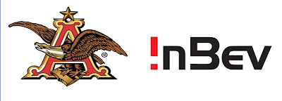 Yesterday AB InBev unveiled their new corporate logo and Brand New made an interesting point about the inclusion of the eagle in a post this afternoon. It's so American. The company is not. So why is this international company using such an American symbol? Yes, there's the argument that AB has quite a bit of equity in the eagle, whereas InBev's logo has little to none, but perhaps it's partially to make us forget AB is no longer American owned?
 Honestly, I would have preferred the logo without the eagle. It's just plain ugly. It's has bad color choices and far too much gradient action happening. Yuck. And the type? Well it has an unnecessary, though slight, drop shadow on it. Enough said.
Another thing to note, why does the AB have such a different type treatment? I realize it's probably to separate the two different companies, but it really feels like two different logos with an eagle plopped on top. Thoughts?
 Yesterday AB InBev unveiled their new corporate logo and Brand New made an interesting point about the inclusion of the eagle in a post this afternoon. It's so American. The company is not. So why is this international company using such an American symbol? Yes, there's the argument that AB has quite a bit of equity in the eagle, whereas InBev's logo has little to none, but perhaps it's partially to make us forget AB is no longer American owned?
 Honestly, I would have preferred the logo without the eagle. It's just plain ugly. It's has bad color choices and far too much gradient action happening. Yuck. And the type? Well it has an unnecessary, though slight, drop shadow on it. Enough said.
Another thing to note, why does the AB have such a different type treatment? I realize it's probably to separate the two different companies, but it really feels like two different logos with an eagle plopped on top. Thoughts?
Monday, November 17, 2008
Social Media Takes A Toll On Motrin
If you follow any Mom blogs or you're on Twitter, it was hard to miss the social media madness around the latest Motrin ad from yesterday and today. Many baby wearing mothers were clearly offended by the Motrin ad which suggests baby wearing can give you back or shoulder pain, and they've made their voices heard—via blogs and Twitter. As far as I can tell, this whole uproar started sometime Saturday afternoon and by mid day today, Motrin had pulled the ad from their homepage and put up an apology letter. Wow.
I'm not a mom, so I really don't fit the demographic they're appealing to here, but I get the tongue-in-cheek humor Motrin was going for. As a creative in the industry, I don't think I would have guessed this ad would offend so much and cause the ruckus that it caused, but at the same time I can see exactly where some of the problems lie.
The art direction is fabulous. I love the technique, though it seems to be a bit trendy at the moment, and the typography and illustration styles are wonderful. The offensiveness comes from a few turns of phrases: in theory it's a good idea, supposedly it's a real bonding experience, etc. They're just a bit too condescending.
There are countless blog posts ranting against this ad as well as the occasional one defending it, and you can view all the Twitter chatter with the #motrinmoms hash tag if you'd like to follow the social media storm.
What do you think? How has social media changed this uproar? Did it blow a little thing into an overboard uproar, giving Motrin some seriously bad PR? Or is it giving Motrin the feedback, and PR, its offensive ad deserves?
Does British Airways Sink or Float with new Terminal 5 Ad?
London Heathrow has just opened its brand-spanking-new Terminal 5. It promises to get you through check-in and security within minutes, tempts with six lounges that include a spa and a cinema, and features a state-of-the-art baggage claim system. Flying through Terminal 5 actually sounds, well, enjoyable.
I saw the new TV spot for Terminal 5 this weekend. The spot is beautiful. I really do like it. But besides being a beautiful ad, it doesn't have much meaning. Now that I've visited the Web site the spot makes a bit more sense, but the ad on its own doesn't convey any of the wonderful features that are supposed to make the new Terminal 5 better than the rest.
I saw the new TV spot for Terminal 5 this weekend. The spot is beautiful. I really do like it. But besides being a beautiful ad, it doesn't have much meaning. Now that I've visited the Web site the spot makes a bit more sense, but the ad on its own doesn't convey any of the wonderful features that are supposed to make the new Terminal 5 better than the rest.
Wednesday, November 12, 2008
Truth in Advertising #31
Concepting doesn't get any easier no matter your longitude, latitude or the fact that you can work in your own comfy slippers.
Tuesday, November 11, 2008
And The Credit Goes To...?
When there's no registered copywright, there's no registered credit. Even when the mark is first designed there's no byline or signature so the credit is unknown to many. How many of you non-designers out there know who designed the Nike logo? The post on ESPN is about two designers who both claimed to have created the logo. No, not two guys who worked together at the same agency or anything, two totally separate designers who both believed they designed it. Neither, however, have any proof. You can't really blame them though, the logo was designed 40 years ago. Who keeps their files that long? All Major League Baseball has is the name of the agency hired, not the individual designer. In this case, that information and a little math did the trick, but what about when the name of the agency isn't enough? Then you need agency files and people's memories to figure out who individually gets the credit. Even in this digital age, files can get lost, agencies can go under and memories can falter.
I have a few logos out there the I'm proud to have designed. Maybe they'll stand the test of time, maybe not, but I think I'll go back up my files anyway.
Thursday, November 6, 2008
How Aware Are You II?
Tuesday, November 4, 2008
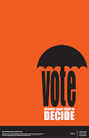
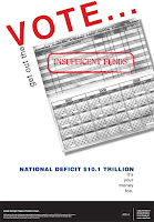
Have You Voted Yet?
AIGA invited designers across the country to participate in their Get Out the Vote 2008 poster campaign. There are tons of fabulous designs at AIGA's website and I've included a couple favorites here. So if you haven't voted yet today, get to it!


Monday, November 3, 2008
Hidden Heads on Cascadian Farm Packaging
A friend forwarded a link to me last week from Bread and Honey, a blog about all things food-related. In this post, they reveal a shocking discovery: Tiny, mysterious faces hidden on the packaging of Cascadian Farm-branded frozen broccoli. It's quite frightening, actually. (Click here to read the post and see the pictures for yourself.)
In the follow-up post it's determined the hidden countenances are friends and family of the Cascadian Farm brand, first put on the packaging by designers over a decade ago.
Kinda creepy. Kinda cool.
In the follow-up post it's determined the hidden countenances are friends and family of the Cascadian Farm brand, first put on the packaging by designers over a decade ago.
Kinda creepy. Kinda cool.
Subscribe to:
Posts (Atom)