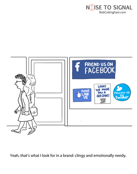
This cartoon came to my attention a couple weeks ago, but I didn't get around to posting it. Having just been asked, yet again, to 'like' another brand on Facebook I remembered I wanted to share.
Facebook pages and Twitter have been around awhile, but the past six months have seen and exponential growth in the number of brands now officially on both social networking sites and trying to use them. Granted, there is some cool stuff going on in this realm, and often following a brand you really like can be beneficial, but the constant requests to 'Like' or 'Follow' your brand are starting to sound like that classmate from high school, whom you barely remember, that keeps trying to 'Friend' you on Facebook. It starts to look a little pathetic.

Thursday, April 21, 2011


Wednesday, April 13, 2011
Adobe Offers CS5.5 and a New Subscription Service
If you're a designer on Twitter, it was hard to miss the promoted tweets from @CreativeSuite on Monday, announcing new CS5.5. Say what? That's right CS5.5. Apparently upgrades every other year were not enough, so now there's a 'half' upgrade each year in order to 'keep creatives at the forefront of technology'—oh, and to make some more money too. Did we mention that part?
Pricing
Adobe's new CS5.5 is at least a cheaper upgrade than it is to a 'full' version. The CS5.5 Design Premium is $399, if you're upgrading from CS4 it's $650. I can't remember what the price was to upgrade from CS4 to CS5 was, but I think it was around $500—maybe $600. (If you have better info on that number, please leave a comment or email me, thanks!) CS updates about every 1 1/2 years, so if you buy every version, you previously would have spent about $330-$400 per year, now you'd spend more like $500-$600 per year (assuming CS6 still releases less than a year from now). This isn't going to be detrimental to agencies, most small and mid-sized agencies (I'm not as sure about the big ones) don't update every version as it is. The people this is going to hurt is the printers—they need to have the latest and greatest because at least one of their clients is going to upgrade when the newest CS version comes out and they'll expect their printer to be compatible. They'll pretty much have to spend the extra dough.
But fear not, Adobe now has a subscription service! That should be more economical, no?
Subscriptions
Adobe's new subscription services guarantee you the latest software at no extra charge—as long as your subscription remains active. My first thought was 'Finally! A way for designers to have affordable access to professional programs on their personal computers too!' It's a beautiful idea in theory—not so much when you crunch the numbers.
Adobe's subscriptions prices and plans are as follows:

There are two plans, the yearly plan, which requires a one year contract at a time, or the month-to-month plan. Is it just me or are these ridiculously overpriced?
Let's stick with the Creative Suite Design Premium (CSDP) package I discussed at the beginning of the post as our reference point. While the initial upstart cost for CSDP is $1900, the upgrades are like $400-$700 depending on how many generations you skipped in between, but let's just say you like to be on the cutting edge and want the latest and greatest software when it comes out. If Adobe came out with a new version every year, your upgrade costs would be $400 per year. On the one year subscription plan you're paying $1140 per year. WHOA. That's $740 more per year.
But wait, you say, you're not including that hefty $1900 initial software investment—well, let's crunch those numbers shall we? Let's take a three year period where you purchase the software and update twice (that would be assuming a new release once a year—more than that is just overkill) That's $1900+$400+$400=$2700. Over that same three year period, you'd spend $3420 on the subscription service and your access to the program ceases as soon as you're not paying anymore! How is that economical? I can see it only if you didn't own CS originally and you knew you'd only use if for one year or if you couldn't afford the initial start up cost—but seriously, at these prices, it's well worth it to ante up initially and own the software.
The month-to-month subscription is a little different. It allows you be a little more flexible. Maybe you're a sporadic freelancer who just needs the programs from time to time. The trouble is, at least for the standard design programs, it's still not cost effective unless subscribing only a couple of months a year, though I can see the month-to-month subscriptions useful when you need one program, like Premiere or AfterEffects, for just one short term project. The downside there is pretty much all of Adobe's products have a high learning curve so it's going to take you awhile to use them well anyway. Then once you're not subscribing, my guess is you no longer can open those files—which could be highly annoying.
I see extremely little use for Adobe's new subscription program. It's an interesting idea for design software, but as it stands right now, there is little financial incentive to go that route. Meanwhile, the 'half' upgrade software seems little more than a blatant attempt to suck more money from designers.
Am I missing something here? What do you think?
Pricing
Adobe's new CS5.5 is at least a cheaper upgrade than it is to a 'full' version. The CS5.5 Design Premium is $399, if you're upgrading from CS4 it's $650. I can't remember what the price was to upgrade from CS4 to CS5 was, but I think it was around $500—maybe $600. (If you have better info on that number, please leave a comment or email me, thanks!) CS updates about every 1 1/2 years, so if you buy every version, you previously would have spent about $330-$400 per year, now you'd spend more like $500-$600 per year (assuming CS6 still releases less than a year from now). This isn't going to be detrimental to agencies, most small and mid-sized agencies (I'm not as sure about the big ones) don't update every version as it is. The people this is going to hurt is the printers—they need to have the latest and greatest because at least one of their clients is going to upgrade when the newest CS version comes out and they'll expect their printer to be compatible. They'll pretty much have to spend the extra dough.
But fear not, Adobe now has a subscription service! That should be more economical, no?
Subscriptions
Adobe's new subscription services guarantee you the latest software at no extra charge—as long as your subscription remains active. My first thought was 'Finally! A way for designers to have affordable access to professional programs on their personal computers too!' It's a beautiful idea in theory—not so much when you crunch the numbers.
Adobe's subscriptions prices and plans are as follows:

There are two plans, the yearly plan, which requires a one year contract at a time, or the month-to-month plan. Is it just me or are these ridiculously overpriced?
Let's stick with the Creative Suite Design Premium (CSDP) package I discussed at the beginning of the post as our reference point. While the initial upstart cost for CSDP is $1900, the upgrades are like $400-$700 depending on how many generations you skipped in between, but let's just say you like to be on the cutting edge and want the latest and greatest software when it comes out. If Adobe came out with a new version every year, your upgrade costs would be $400 per year. On the one year subscription plan you're paying $1140 per year. WHOA. That's $740 more per year.
But wait, you say, you're not including that hefty $1900 initial software investment—well, let's crunch those numbers shall we? Let's take a three year period where you purchase the software and update twice (that would be assuming a new release once a year—more than that is just overkill) That's $1900+$400+$400=$2700. Over that same three year period, you'd spend $3420 on the subscription service and your access to the program ceases as soon as you're not paying anymore! How is that economical? I can see it only if you didn't own CS originally and you knew you'd only use if for one year or if you couldn't afford the initial start up cost—but seriously, at these prices, it's well worth it to ante up initially and own the software.
The month-to-month subscription is a little different. It allows you be a little more flexible. Maybe you're a sporadic freelancer who just needs the programs from time to time. The trouble is, at least for the standard design programs, it's still not cost effective unless subscribing only a couple of months a year, though I can see the month-to-month subscriptions useful when you need one program, like Premiere or AfterEffects, for just one short term project. The downside there is pretty much all of Adobe's products have a high learning curve so it's going to take you awhile to use them well anyway. Then once you're not subscribing, my guess is you no longer can open those files—which could be highly annoying.
I see extremely little use for Adobe's new subscription program. It's an interesting idea for design software, but as it stands right now, there is little financial incentive to go that route. Meanwhile, the 'half' upgrade software seems little more than a blatant attempt to suck more money from designers.
Am I missing something here? What do you think?
Tuesday, April 12, 2011
Turn Your House Into A Giant Billboard

The company is looking for houses in California and as of last week had received over 1,000 applicants. It's definitely not for everyone, but it sure beats foreclosure.
Would you paint your house as a giant billboard for Adzookie?
Thursday, February 10, 2011
The Anti Social Super Bowl?
Did the Super Bowl commercial lack social media components this year? According to this article from Ad Age, yes, they did. With the number of people with smart phones these days and the power of social media marketing it is surprising there weren't ANY integrated campaigns.
Granted, I learned from the Super Bowl of Social Media voting site that the Doritos and Pepsi Max spots were consumer generated concepts that the brands then produced for the Super Bowl. I had no idea. There was no press that I knew of and no indication prior to the spots airing that they were user generated. It does explain the fragmentation and appearance of a lack of a unified campaign. Honestly, they were some of my least favorite since they seemed contrived with too much cheap humor. Some of them actually offended my parents and I found them rather yawn-worthy. Haven't we seen that same crap in the last five years of Super Bowls? I'm actually more sad to find out those were user generated—there's got to be some better ideas out there.
Ian Schafer's Ad Age article cites some great examples of what could have been done with the campaigns that ran to make them more social. He chides Chrysler, Motorola and Coke for not reaping clear tie-ins that would have worked centrally with their Super Bowl campaigns. I loved the 'Imported from Detroit' ad from Chrysler, but why didn't Chrysler tie that in to some charitable cause for Detroit? It would have to be the right charity, but it would have been brilliant. You have millions watching, enraptured by the commercial, feeling the American Pride for Detroit—the right charitable tie in would have given Chrysler the image of a car company that cares as much about its city as it does about selling cars.
Schafer argues that incorporating social media would have given these campaigns legs beyond the Bowl. As it is, many of the commercials will continue airing for months, but I think he has a point. The social aspect would give you legs and interaction beyond the television. And isn't that what all brands are trying to do these days?
I wasn't watching the game, poised with my iPhone, but it was just across the room. I think I would have engaged if I'd been asked. Would you? Did you think the Super Bowl was lacking in social media aspects?
Granted, I learned from the Super Bowl of Social Media voting site that the Doritos and Pepsi Max spots were consumer generated concepts that the brands then produced for the Super Bowl. I had no idea. There was no press that I knew of and no indication prior to the spots airing that they were user generated. It does explain the fragmentation and appearance of a lack of a unified campaign. Honestly, they were some of my least favorite since they seemed contrived with too much cheap humor. Some of them actually offended my parents and I found them rather yawn-worthy. Haven't we seen that same crap in the last five years of Super Bowls? I'm actually more sad to find out those were user generated—there's got to be some better ideas out there.
Ian Schafer's Ad Age article cites some great examples of what could have been done with the campaigns that ran to make them more social. He chides Chrysler, Motorola and Coke for not reaping clear tie-ins that would have worked centrally with their Super Bowl campaigns. I loved the 'Imported from Detroit' ad from Chrysler, but why didn't Chrysler tie that in to some charitable cause for Detroit? It would have to be the right charity, but it would have been brilliant. You have millions watching, enraptured by the commercial, feeling the American Pride for Detroit—the right charitable tie in would have given Chrysler the image of a car company that cares as much about its city as it does about selling cars.
Schafer argues that incorporating social media would have given these campaigns legs beyond the Bowl. As it is, many of the commercials will continue airing for months, but I think he has a point. The social aspect would give you legs and interaction beyond the television. And isn't that what all brands are trying to do these days?
I wasn't watching the game, poised with my iPhone, but it was just across the room. I think I would have engaged if I'd been asked. Would you? Did you think the Super Bowl was lacking in social media aspects?
Monday, February 7, 2011
Super Bowl Ads: Celebrities A-Plenty, Hits A-Few
There were a lot of celebrities in this year's set of Super Bowl ads, from Joan Rivers for Go Daddy, to P. Diddy for Mercedes, to the Osbourne's and Justin Bieber for Best Buy, but few of them hit a home run. Honestly, I think my favorite commercial was the pre-released VW ad (sans celebrity) that I blogged about last Friday. You had to have a pretty good knowledge of pop culture to understand all of the references in the commercials and I happened to be watching the game with my parents, who understood very few of them. As the New York Times stated:
In the realm of soda advertising, a few of the plethora of Pepsi Max commercials managed to completely offend my parents. Even I found them in rather poor taste. Buying that many Super Bowl spots doesn't help your brand if they're a total turn off. Coca Cola's 'Open Happiness' commercials were good, though underwhelming compared to some of their classics like the Happiness Factory from a few years ago.
Below are the best of the lot (in my humble opinion):
Volkswagon
I blogged about this one on Friday, but it's my favorite so it's getting included again.
Motorola
Motorola took a stab at Apple with it's 'Empower the People' 1984 reminiscent spot to introduce its rival to the iPad. Only this campaign is turning the tables to make Apple the drone-creating big brother company. (Check out the original Apple 1984 commercial here.)
Bridgestone
Okay, so the Bridgestone beaver ad is a little cliche and a little reminiscent of the Geico squirrel ad from years ago, but it still made me smile.
Chrysler
The best car commercial of the lot, in my opinion, and one of the only celebrity uses that seemed fitting, was Chrysler's 'Imported from Detroit'. There was something about this commercial that reminded you of the American Pride that Detroit used to represent. Something that reminded you that Detroit is part of our country and it's survival is important to the rest of the country too. It was a refreshing car commercial and Eminem, while not necessary for the spot's impact, exemplified working class Detroit and money at the same time, so at least his placement made sense and had some meaning.
To fully appreciate the commercials, it helped to be at least passingly familiar with “Almost Famous,” “Back to the Future,” Roseanne Barr, Busby Berkeley, Justin Bieber, Adrien Brody, David Bowie, Diddy, the “Dogs Playing Poker” paintings, Howdy Doody, early video games, Thomas Edison and Eminem (who turned up in two spots, for Chrysler and Lipton Brisk).There were also quite a few car commercials during last night's game, from the P. Diddy Mercedes commercial celebrating it's history to the tune of Janis Joplin's Mercedes Benz. The spot was pretty good, but P. Diddy seemed like a random, unnecessary add-on and distraction from the rest of the spot. Meanwhile, Audi targeted Mercedes as the confines of old luxury complete with a cameo from Kenny G and a stuffed Dodo bird.
In the realm of soda advertising, a few of the plethora of Pepsi Max commercials managed to completely offend my parents. Even I found them in rather poor taste. Buying that many Super Bowl spots doesn't help your brand if they're a total turn off. Coca Cola's 'Open Happiness' commercials were good, though underwhelming compared to some of their classics like the Happiness Factory from a few years ago.
Below are the best of the lot (in my humble opinion):
Volkswagon
I blogged about this one on Friday, but it's my favorite so it's getting included again.
Motorola
Motorola took a stab at Apple with it's 'Empower the People' 1984 reminiscent spot to introduce its rival to the iPad. Only this campaign is turning the tables to make Apple the drone-creating big brother company. (Check out the original Apple 1984 commercial here.)
Bridgestone
Okay, so the Bridgestone beaver ad is a little cliche and a little reminiscent of the Geico squirrel ad from years ago, but it still made me smile.
Chrysler
The best car commercial of the lot, in my opinion, and one of the only celebrity uses that seemed fitting, was Chrysler's 'Imported from Detroit'. There was something about this commercial that reminded you of the American Pride that Detroit used to represent. Something that reminded you that Detroit is part of our country and it's survival is important to the rest of the country too. It was a refreshing car commercial and Eminem, while not necessary for the spot's impact, exemplified working class Detroit and money at the same time, so at least his placement made sense and had some meaning.
Friday, February 4, 2011
The Pre-Super Bowl Super Bowl Ad Release
Has Volkswagen set a new trend? The Pre-Super Bowl Super Bowl ad release on the internet? Volkswagen 'leaked' its Super Bowl ad for this year a few days early. Personally, I think that's a trend that's going to catch on. I mean, millions of people watch the Super Bowl. Most people watch it for the game and continue to enjoy the usually high quality ads that accompany the game, as well as a few people that just watch it for the ads.
The trouble is, when watching 3+ hours of television, often at a party or bar, are you really going to have your eyes glued to the TV the whole time? Of course not. Which is why, inevitably, you miss 'that really good' commercial because you ran into the kitchen for a beer or more chips or whatever, and have to wait until the following day (when they're all on YouTube) to catch up with the spot everyone is talking about. Why not release the ad early, to the internet crowd and have them drum up excitement for its airtime on game day? Think about how many people will mention to friends, 'Did you see the VW Darth Vader spot? It's so cute—watch for it!' Plenty.
Granted, some of the talk will dissipate if more and more brands pre-release, but it is a good way to make sure you're spot is seen and remembered. What do you think?
Check out Volkswagen's pre-released tiny Darth Vader spot below. It's pretty cute.
The trouble is, when watching 3+ hours of television, often at a party or bar, are you really going to have your eyes glued to the TV the whole time? Of course not. Which is why, inevitably, you miss 'that really good' commercial because you ran into the kitchen for a beer or more chips or whatever, and have to wait until the following day (when they're all on YouTube) to catch up with the spot everyone is talking about. Why not release the ad early, to the internet crowd and have them drum up excitement for its airtime on game day? Think about how many people will mention to friends, 'Did you see the VW Darth Vader spot? It's so cute—watch for it!' Plenty.
Granted, some of the talk will dissipate if more and more brands pre-release, but it is a good way to make sure you're spot is seen and remembered. What do you think?
Check out Volkswagen's pre-released tiny Darth Vader spot below. It's pretty cute.
Tuesday, January 25, 2011
Starbucks Chooses Siren Over Recognized Name
Okay, I realize I'm committing the cardinal sin of blogging by being oh, about 2 weeks or so late to the punch, but I was blissfully lying on a beach sipping piña coladas when the Starbucks news broke and am only now really getting back into the swing of things. Apologies dear readers on being so delayed on such big logo redesign news!
If you haven't yet heard, and I don't know how that's possible, Starbucks dramatically changed it's logo—cutting out the words 'Starbucks Coffee' and using just the image of the siren in Starbucks green. I posted a few years ago about Starbucks' logo evolution with a link to an AdFreak article showing and discussing the various changes in the logo. My original post was sparked by a news story about a conservative group getting upset over Starbucks using their original logo—which has a more scandalous version of the siren their latest logo focuses in on.

People tend to be rather divided on their opinion of Starbucks new logo. My initial reaction was 'Why did they do that? Most people don't even notice the siren.' Not to mention those that noticed it in the past, weren't so thrilled with it's legs (or fins) wide open message (hence the premise for the old post). There was some email bantering about among the creatives at my agency when the news broke and amid the overall dislike of the logo, there were two main points that I agree with.
First, to many consumers, the name Starbucks and its typography in the green circle was as much, if not more so, the logo than the siren was. So eliminating the typography from the logo, while theoretically great for brand evolution, just doesn't seem to fit. The logo was developed internally at Starbucks, which could be some of the roadblock. I'm guessing the siren plays a much bigger part of their internal corporate identity than it does outside Starbucks' corporate walls. That's not to say the siren isn't identified with Starbucks identity, but it's just not was people remember and visualize when they think of the Starbucks logo in their head. Then again, maybe this decision was intended to change that perception.
Second, the siren by herself just doesn't hold her own. Okay, so Starbucks wanted an evolution of their logo for their 40th anniversary. They didn't want to go just Starbucks or Starbucks Coffee (the thought is this is because they plan to grow beyond coffee and continue to globalize—see the video below) so they went with the siren by herself. Some supporters of the logo point out that this is the epitome of a brand—when their identity can go completely visual with no type identifier. Think Apple or Nike. Starbucks kind of falls into that category, but not as well. It's not like people are not going to recognize the new mark, but it just doesn't have the same simplicity. The new logo should have an updated siren as well, especially considering the evolution of that part of the logo. Perhaps an updated siren with a simplification of the type (cut the words coffee?) for an eventual simplification to a logo only? Just a thought.
I don't think the new logo is going to hurt Starbucks. Indeed, I think most people have already forgotten about the redesign uproar, but I don't think it was quite the right move. It is rather uninspired and needs more simplification to really stand on it's own.
What do you think of the new Starbucks logo? Love it? Hate it?
*Also, check out this video from Starbucks introducing the new logo:
If you haven't yet heard, and I don't know how that's possible, Starbucks dramatically changed it's logo—cutting out the words 'Starbucks Coffee' and using just the image of the siren in Starbucks green. I posted a few years ago about Starbucks' logo evolution with a link to an AdFreak article showing and discussing the various changes in the logo. My original post was sparked by a news story about a conservative group getting upset over Starbucks using their original logo—which has a more scandalous version of the siren their latest logo focuses in on.
People tend to be rather divided on their opinion of Starbucks new logo. My initial reaction was 'Why did they do that? Most people don't even notice the siren.' Not to mention those that noticed it in the past, weren't so thrilled with it's legs (or fins) wide open message (hence the premise for the old post). There was some email bantering about among the creatives at my agency when the news broke and amid the overall dislike of the logo, there were two main points that I agree with.
First, to many consumers, the name Starbucks and its typography in the green circle was as much, if not more so, the logo than the siren was. So eliminating the typography from the logo, while theoretically great for brand evolution, just doesn't seem to fit. The logo was developed internally at Starbucks, which could be some of the roadblock. I'm guessing the siren plays a much bigger part of their internal corporate identity than it does outside Starbucks' corporate walls. That's not to say the siren isn't identified with Starbucks identity, but it's just not was people remember and visualize when they think of the Starbucks logo in their head. Then again, maybe this decision was intended to change that perception.
Second, the siren by herself just doesn't hold her own. Okay, so Starbucks wanted an evolution of their logo for their 40th anniversary. They didn't want to go just Starbucks or Starbucks Coffee (the thought is this is because they plan to grow beyond coffee and continue to globalize—see the video below) so they went with the siren by herself. Some supporters of the logo point out that this is the epitome of a brand—when their identity can go completely visual with no type identifier. Think Apple or Nike. Starbucks kind of falls into that category, but not as well. It's not like people are not going to recognize the new mark, but it just doesn't have the same simplicity. The new logo should have an updated siren as well, especially considering the evolution of that part of the logo. Perhaps an updated siren with a simplification of the type (cut the words coffee?) for an eventual simplification to a logo only? Just a thought.
I don't think the new logo is going to hurt Starbucks. Indeed, I think most people have already forgotten about the redesign uproar, but I don't think it was quite the right move. It is rather uninspired and needs more simplification to really stand on it's own.
What do you think of the new Starbucks logo? Love it? Hate it?
*Also, check out this video from Starbucks introducing the new logo:
Monday, December 13, 2010
The B10
Awhile ago, I posted about the Big Ten's logo issue with adding a few more teams. Their old logo reflected the 11th edition with a nice, subtle 11 within the logo. Well, the new logo was unveiled and unfortunately, it's not nearly as sweet as the old logo's negative space 11.
Apparently foreseeing that the number of teams in the Big Ten conference will continue to change over the years, the organization has simply reverted to a B10 reference within the logo. See the I in Big is really a one? And then the G is formed to look like a 0? It took me awhile to figure it out. I saw the 1 right away, but didn't catch the 0 until I saw the B10/BIG logo with the B in black. It doesn't really have the same purpose or point as the 11 did in the old logo, but oh well. It could've been worse.


 |
| Old logo |

Thursday, November 11, 2010
SMOKING IS BAD FOR YOU!!!
At least that's what the F.D.A. wants to make sure you realize every time you pick up a pack of cigarettes. They just released some of the new warning labels for cigarette packs and they are quite the jump up from the old Surgeon General's warning.

But will they work?
This article in the New York Times references that research shows this type of communication does work to deter smoking. They remind me of the warnings I remember seeing on cigarette packs in Europe. That was years ago and apparently they've gotten even more graphic since I was reading (and I'll admit, laughing at) the warnings on those labels. Europe, and other countries in general, tend to have much more shocking PSAs than we do.
That being said, those strong warnings in Europe don't seem to be doing anything to help the problem. The U.S. is decidedly less smoke friendly than Europe—at least from my experience. I have a hard time believing that teenagers drawn to smoking won't just make fun of these. I hope they don't, I hope it hits home, but I'm really not sure that it will.
What do you think?
But will they work?
This article in the New York Times references that research shows this type of communication does work to deter smoking. They remind me of the warnings I remember seeing on cigarette packs in Europe. That was years ago and apparently they've gotten even more graphic since I was reading (and I'll admit, laughing at) the warnings on those labels. Europe, and other countries in general, tend to have much more shocking PSAs than we do.
That being said, those strong warnings in Europe don't seem to be doing anything to help the problem. The U.S. is decidedly less smoke friendly than Europe—at least from my experience. I have a hard time believing that teenagers drawn to smoking won't just make fun of these. I hope they don't, I hope it hits home, but I'm really not sure that it will.
What do you think?
Friday, October 29, 2010
The (Twitter) Empowered Consumer
I just got the upgrade to Adobe CS5 yesterday. Yep, it was a pretty sweet day—until Photoshop CS5 started crashing my computer regularly. I couldn't do anything. I had to constantly restart my entire computer and with a few deadlines looming, my patience with the program got really short, really fast.
After talking with IT, it looked like all I needed was some upgrades, so I managed to work around it yesterday afternoon to hit my end of day deadlines and planned to update first thing this morning. IT graciously updated my computer early this morning before I even got in. Unfortunately, it didn't do a thing.
By crash number four of the morning, I was royally ticked.
What did I do? Well I tweeted my frustration of course. My computer was restarting—again—so I pulled out my iPhone and let Adobe have it—hash tagging everything I could. I wanted anyone considering the upgrade to know this was a very bad potential issue. That and I knew Adobe would here it—if they were social media smart.
 Well darned if a guy from Adobe hadn't responded by the time my Firefox was up and running again. Good job Adobe. He also managed to steer me, and IT, to some links that eventually fixed the problem. It still took some sweat and some cursing before it managed to work quite right, but throughout I was able to communicate with someone from Adobe. He even offered to get someone in touch to work through the problem when things were not looking good.
The customer service component of Twitter is quite the phenomenon. Seriously, if you aren't on Twitter, you really should be—just for this aspect if nothing else. And if you're a brand that's not monitoring tweets like mine, you really should be—it can quickly escalate. Just ask Motrin.
The best part about Twitter-style customer service is the timing, the lightening speed that you get in contact with someone—no phone menus involved. The first time I experienced it was at a local restaurant that had built its business with Twitter—they sponsor local Tweet Ups, etc. I'll admit, I originally went there since I'd heard so much about it on Twitter. Well, it was my first time there and my dessert really sucked—it was a giant cookie and it was completely overcooked and dry. I'm not the type to outright tell my waitress that the dessert sucked, but I did tweet about it. The response was immediate—like within a few minutes. Unfortunately I didn't check my phone until I was on the way home, but I was able to express my annoyance and clearly have it heard and got an apology and a sincere effort to keep me as a customer. It made me much more likely to return.
What's the moral? Twitter is fast becoming the best way for customers to interact with their brands. It brings the brands to a somewhat personal level—even if you're just tweeting back and forth with the brand name. They have a personality and if it's done right, it really can make you feel like a valued customer, no matter how ticked you are.
After talking with IT, it looked like all I needed was some upgrades, so I managed to work around it yesterday afternoon to hit my end of day deadlines and planned to update first thing this morning. IT graciously updated my computer early this morning before I even got in. Unfortunately, it didn't do a thing.
By crash number four of the morning, I was royally ticked.
What did I do? Well I tweeted my frustration of course. My computer was restarting—again—so I pulled out my iPhone and let Adobe have it—hash tagging everything I could. I wanted anyone considering the upgrade to know this was a very bad potential issue. That and I knew Adobe would here it—if they were social media smart.
 Well darned if a guy from Adobe hadn't responded by the time my Firefox was up and running again. Good job Adobe. He also managed to steer me, and IT, to some links that eventually fixed the problem. It still took some sweat and some cursing before it managed to work quite right, but throughout I was able to communicate with someone from Adobe. He even offered to get someone in touch to work through the problem when things were not looking good.
The customer service component of Twitter is quite the phenomenon. Seriously, if you aren't on Twitter, you really should be—just for this aspect if nothing else. And if you're a brand that's not monitoring tweets like mine, you really should be—it can quickly escalate. Just ask Motrin.
The best part about Twitter-style customer service is the timing, the lightening speed that you get in contact with someone—no phone menus involved. The first time I experienced it was at a local restaurant that had built its business with Twitter—they sponsor local Tweet Ups, etc. I'll admit, I originally went there since I'd heard so much about it on Twitter. Well, it was my first time there and my dessert really sucked—it was a giant cookie and it was completely overcooked and dry. I'm not the type to outright tell my waitress that the dessert sucked, but I did tweet about it. The response was immediate—like within a few minutes. Unfortunately I didn't check my phone until I was on the way home, but I was able to express my annoyance and clearly have it heard and got an apology and a sincere effort to keep me as a customer. It made me much more likely to return.
What's the moral? Twitter is fast becoming the best way for customers to interact with their brands. It brings the brands to a somewhat personal level—even if you're just tweeting back and forth with the brand name. They have a personality and if it's done right, it really can make you feel like a valued customer, no matter how ticked you are.
Subscribe to:
Posts (Atom)