It's almost shameful that I wasn't aware of this ad until last week when my non-advertising boyfriend showed me this ad shown to him in a presentation on branding at work. (I'm maintaining it's because it's a french brand—I think). It's a four year old ad that's brilliant—with a great follow through component as well. Check it out:
I'm not a big fan of the video game-like graphics for the animation, but it makes sense with the online game conclusion. It's a testament to the ad that it's still running and relevant over four years after it's inception. It's also a testament that as a girl who's razor brand knowledge stopped at Gillette, that I now know and remember Wilkinson as a brand.
Maybe it's because the ad strikes the a true note—even for someone without kids. I played this ad for a friend with a 3-year-old son. She kept laughing and saying, "It's so true though!"
The online game is pretty fun too—you can fight with such devilish weapons as pillows and teddy bears. It definitely had my non-gaming boyfriend playing it for some time. Check it out at Wilkinson's website!
Time Magazine is doing an interesting cross promotion with video gameCall of Duty: Modern Warfare 3 by lending it's iconic cover template for a faux cover claiming 'World Stands On The Brink' while Wall Street smolders in the background. Time apparently even helped art direct the cover.
Time says that it's involved in the cross promotion in order to reach a new demographic of customers, while critics have a hard time seeing it really reach gamers and in the meantime it dilutes the brand image. I think Time isn't far off in how their trying to reach a new demographic—the usage of the magazine is appropriate and similar to how it's used in say, product placement in a movie for example. I don't think this treatment necessarily dilutes the brand image any more than that would. If anything, it's reminding them of Time's iconic place in the realm of news magazines.
But there is a catch—if Time is looking for growth in magazine subscriptions and not just awareness we have a problem. Why? Because I don't think too many gamers are the types to buy paper news magazines. They're much more likely to get that news online and given the constant dialogue about the best way for newspapers and magazines will be able to monetize their online operations as print declines. But that's another story...
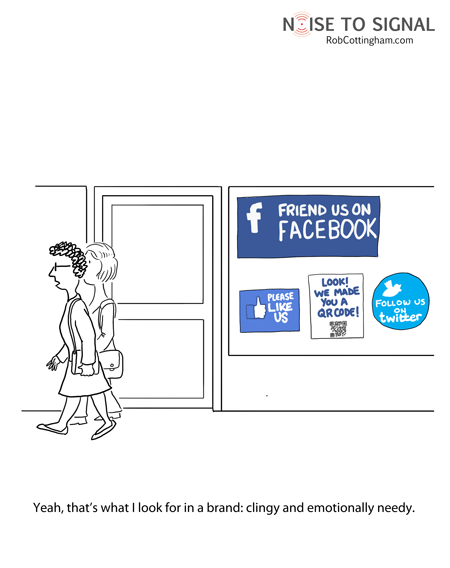
This cartoon came to my attention a couple weeks ago, but I didn't get around to posting it. Having just been asked, yet again, to 'like' another brand on Facebook I remembered I wanted to share.
Facebook pages and Twitter have been around awhile, but the past six months have seen and exponential growth in the number of brands now officially on both social networking sites and trying to use them. Granted, there is some cool stuff going on in this realm, and often following a brand you really like can be beneficial, but the constant requests to 'Like' or 'Follow' your brand are starting to sound like that classmate from high school, whom you barely remember, that keeps trying to 'Friend' you on Facebook. It starts to look a little pathetic.
Did the Super Bowl commercial lack social media components this year? According to this article from Ad Age, yes, they did. With the number of people with smart phones these days and the power of social media marketing it is surprising there weren't ANY integrated campaigns.
Granted, I learned from the Super Bowl of Social Media voting site that the Doritos and Pepsi Max spots were consumer generated concepts that the brands then produced for the Super Bowl. I had no idea. There was no press that I knew of and no indication prior to the spots airing that they were user generated. It does explain the fragmentation and appearance of a lack of a unified campaign. Honestly, they were some of my least favorite since they seemed contrived with too much cheap humor. Some of them actually offended my parents and I found them rather yawn-worthy. Haven't we seen that same crap in the last five years of Super Bowls? I'm actually more sad to find out those were user generated—there's got to be some better ideas out there.
Ian Schafer's Ad Age article cites some great examples of what could have been done with the campaigns that ran to make them more social. He chides Chrysler, Motorola and Coke for not reaping clear tie-ins that would have worked centrally with their Super Bowl campaigns. I loved the 'Imported from Detroit' ad from Chrysler, but why didn't Chrysler tie that in to some charitable cause for Detroit? It would have to be the right charity, but it would have been brilliant. You have millions watching, enraptured by the commercial, feeling the American Pride for Detroit—the right charitable tie in would have given Chrysler the image of a car company that cares as much about its city as it does about selling cars.
Schafer argues that incorporating social media would have given these campaigns legs beyond the Bowl. As it is, many of the commercials will continue airing for months, but I think he has a point. The social aspect would give you legs and interaction beyond the television. And isn't that what all brands are trying to do these days?
I wasn't watching the game, poised with my iPhone, but it was just across the room. I think I would have engaged if I'd been asked. Would you? Did you think the Super Bowl was lacking in social media aspects?
Okay, I realize I'm committing the cardinal sin of blogging by being oh, about 2 weeks or so late to the punch, but I was blissfully lying on a beach sipping piña coladas when the Starbucks news broke and am only now really getting back into the swing of things. Apologies dear readers on being so delayed on such big logo redesign news!
If you haven't yet heard, and I don't know how that's possible, Starbucks dramatically changed it's logo—cutting out the words 'Starbucks Coffee' and using just the image of the siren in Starbucks green. I posted a few years ago about Starbucks' logo evolution with a link to an AdFreak article showing and discussing the various changes in the logo. My original post was sparked by a news story about a conservative group getting upset over Starbucks using their original logo—which has a more scandalous version of the siren their latest logo focuses in on.
People tend to be rather divided on their opinion of Starbucks new logo. My initial reaction was 'Why did they do that? Most people don't even notice the siren.' Not to mention those that noticed it in the past, weren't so thrilled with it's legs (or fins) wide open message (hence the premise for the old post). There was some email bantering about among the creatives at my agency when the news broke and amid the overall dislike of the logo, there were two main points that I agree with.
First, to many consumers, the name Starbucks and its typography in the green circle was as much, if not more so, the logo than the siren was. So eliminating the typography from the logo, while theoretically great for brand evolution, just doesn't seem to fit. The logo was developed internally at Starbucks, which could be some of the roadblock. I'm guessing the siren plays a much bigger part of their internal corporate identity than it does outside Starbucks' corporate walls. That's not to say the siren isn't identified with Starbucks identity, but it's just not was people remember and visualize when they think of the Starbucks logo in their head. Then again, maybe this decision was intended to change that perception.
Second, the siren by herself just doesn't hold her own. Okay, so Starbucks wanted an evolution of their logo for their 40th anniversary. They didn't want to go just Starbucks or Starbucks Coffee (the thought is this is because they plan to grow beyond coffee and continue to globalize—see the video below) so they went with the siren by herself. Some supporters of the logo point out that this is the epitome of a brand—when their identity can go completely visual with no type identifier. Think Apple or Nike. Starbucks kind of falls into that category, but not as well. It's not like people are not going to recognize the new mark, but it just doesn't have the same simplicity. The new logo should have an updated siren as well, especially considering the evolution of that part of the logo. Perhaps an updated siren with a simplification of the type (cut the words coffee?) for an eventual simplification to a logo only? Just a thought.
I don't think the new logo is going to hurt Starbucks. Indeed, I think most people have already forgotten about the redesign uproar, but I don't think it was quite the right move. It is rather uninspired and needs more simplification to really stand on it's own.
What do you think of the new Starbucks logo? Love it? Hate it?
*Also, check out this video from Starbucks introducing the new logo:
Awhile ago, I posted about the Big Ten's logo issue with adding a few more teams. Their old logo reflected the 11th edition with a nice, subtle 11 within the logo. Well, the new logo was unveiled and unfortunately, it's not nearly as sweet as the old logo's negative space 11.
Old logo
Apparently foreseeing that the number of teams in the Big Ten conference will continue to change over the years, the organization has simply reverted to a B10 reference within the logo. See the I in Big is really a one? And then the G is formed to look like a 0? It took me awhile to figure it out. I saw the 1 right away, but didn't catch the 0 until I saw the B10/BIG logo with the B in black. It doesn't really have the same purpose or point as the 11 did in the old logo, but oh well. It could've been worse.
I just got the upgrade to Adobe CS5 yesterday. Yep, it was a pretty sweet day—until Photoshop CS5 started crashing my computer regularly. I couldn't do anything. I had to constantly restart my entire computer and with a few deadlines looming, my patience with the program got really short, really fast.
After talking with IT, it looked like all I needed was some upgrades, so I managed to work around it yesterday afternoon to hit my end of day deadlines and planned to update first thing this morning. IT graciously updated my computer early this morning before I even got in. Unfortunately, it didn't do a thing.
By crash number four of the morning, I was royally ticked.
What did I do? Well I tweeted my frustration of course. My computer was restarting—again—so I pulled out my iPhone and let Adobe have it—hash tagging everything I could. I wanted anyone considering the upgrade to know this was a very bad potential issue. That and I knew Adobe would here it—if they were social media smart.
Well darned if a guy from Adobe hadn't responded by the time my Firefox was up and running again. Good job Adobe. He also managed to steer me, and IT, to some links that eventually fixed the problem. It still took some sweat and some cursing before it managed to work quite right, but throughout I was able to communicate with someone from Adobe. He even offered to get someone in touch to work through the problem when things were not looking good.
The customer service component of Twitter is quite the phenomenon. Seriously, if you aren't on Twitter, you really should be—just for this aspect if nothing else. And if you're a brand that's not monitoring tweets like mine, you really should be—it can quickly escalate. Just ask Motrin.
The best part about Twitter-style customer service is the timing, the lightening speed that you get in contact with someone—no phone menus involved. The first time I experienced it was at a local restaurant that had built its business with Twitter—they sponsor local Tweet Ups, etc. I'll admit, I originally went there since I'd heard so much about it on Twitter. Well, it was my first time there and my dessert really sucked—it was a giant cookie and it was completely overcooked and dry. I'm not the type to outright tell my waitress that the dessert sucked, but I did tweet about it. The response was immediate—like within a few minutes. Unfortunately I didn't check my phone until I was on the way home, but I was able to express my annoyance and clearly have it heard and got an apology and a sincere effort to keep me as a customer. It made me much more likely to return.
What's the moral? Twitter is fast becoming the best way for customers to interact with their brands. It brings the brands to a somewhat personal level—even if you're just tweeting back and forth with the brand name. They have a personality and if it's done right, it really can make you feel like a valued customer, no matter how ticked you are.
A little over a week ago the Gap suddenly announced a new logo. A very generic logo that boiled down their iconic brand to typeset Helvetica and a blue box. I wasn't a particular fan—my immediate reaction was why? Why do this to your simple, yet effective blue box? A simple Helvetica typeset only improves a logo if it was hideous or too busy to begin with—and that was simply not the case here. All it does is make it extremely generic.
I intended to post about it immediately, though a busy schedule both in and out of work prevented me from really having time to collect my thoughts about it. As luck would have it consumers on Twitter and Facebook ranted plenty for me and shockingly, the Gap did an about face last Tuesday, announcing that they were ditching their new logo in favor of the old one. Thank goodness.
Of course, that was after they ran a crowd sourcing campaign to design their new logo. Crowd sourcing is a cool idea, but maybe not the right approach for your core brand identity—you get a lot of crappy logos. Check out Brand New's post on it, they highlight some of the pieces. And if you scroll down, they'll give you a taste of exactly how generic that new Gap logo really was—by applying the same treatment to a number of other iconic brands. It made me laugh.
Kudos to Gap for swallowing their pride and relenting that what was probably months of hard work was misguided and hated by their target audience (assuming the whole thing was not a big publicity stunt as some have suggested). It really is an interesting study on the power of social media in today's consumer market. Everywhere from brands to politics, one false move can create an enormous wave of bad publicity and anger from the people you're trying to please.
The program essentially gives monthly grants to different organizations or ideas that are chosen via online voting by the general public. It's like a social responsibility idea generation site funded by a major soft drink company. Anyone can submit an idea and anyone can vote. Pretty cool. There are a four different monetary categories that an idea can compete in from $5,000 to $250,000 and Pepsi awards the top winners in each category—how many top ideas depends on the monetary amount (i.e. many more $5,000 idea projects are funded than $250,000 projects).
So far the level of engagement is huge! It's a challenge just to get your idea in the running (they only accept so many ideas per month for voting) and then the voting competition is fierce. It's great to see so much engagement between a company, it's consumers and a wide variety of charities and community projects.
Okay, I'm gushing a little, but I'm a fan of CSR programs. Some people write them off as merely green washing large corporations to make them feel friendlier, and sure, most companies aren't going to participate in such a program unless they see some sort of ROI, but even so, don't you like seeing corporate money going to good causes? I do.
Shameless Plug
So I've never done this on the blog before, but I am going to give a shameless plug for a cause competing in the Pepsi Refresh Project this month. I know some of the people involved with the Global Genes Project, which is working with the Children's Rare Disease Network for their Pepsi Refresh idea. Essentially, the Global Genes Project aspires to serve as an awareness and funding platform for rare diseases. Rare diseases suffer in these areas simply because they're each so rare, but if you add up all of the rare diseases and the number of people affected by them, you start to get more significant numbers. Therefore the Global Genes Project is a way for many smaller rare disease charities to work together toward mutual goals. Pretty cool idea honestly and it's up for the $250,000 Pepsi Refresh Grant to help jump start it (the Global Genes initiative is only about a year old). If you're so inclined, please check out vote4hope.org where they'll show you three different ways you can vote in the Pepsi Refresh Project for the idea. It's currently around #23 and only the top two ideas get the grant. You get up to 10 votes per day, so you can vote for other ideas too. Check it out!
Earlier this year, the Supreme Court made a wildly unpopular decision to eliminate the limitations for corporate entities' campaign contributions. Essentially, any corporation or union can give as much money as they like to any candidate this election season—and we're starting to see some of the consequences. We will inevitably go through a long, annoying season of terrible, often misleading tv, radio, online ads and robo calls.
Bad advertising aside, the new law change seems to have brought about more controversial corporate donations. Perhaps it's just more scrutiny on those donations, but brands beware—consumers are watching who you're giving political money to and they may not always agree with you.
Take the recent news with Target. About a week or so ago, gay rights groups and other liberals learned that Target had given $150,000 to the conservative Republican, anti-gay candidate and they got upset. Very upset. Boycotts were organized, flash mobs popped up and the controversy has made it into the top national news. Oops. It's an interesting move on Target's part since they target pretty young (which often translates into liberal), trendy consumers. Perhaps they thought no one would notice? Best Buy also gave to the candidate, and while not feeling the heat quite as much as Target, they're not being spared either.
In the NPR story, GE (which owns NBC, CNBC and MSNBC) was given as an example of a company that did political giving right. It gave exactly the same amount to both parties for the hotly contested governor's race in Wisconsin. On the flip side, Comcast gave money to both parties, but it gave more to the Democrats.
So should brands really be dipping their pocketbooks into politics? I don't think so. If you're a brand and want to support the political system, or even a specific candidate, you're going to have to give to both parties or risk alienating customers. In today's very polarized political climate I think a lot a people will stay more loyal to their politics than their brands. What do you think?
If you haven't heard about the Old Spice campaign from the brilliant minds at Wieden + Kennedy, you must have unplugged yourself from the internet or boycotted all social media outlets. The hilarious, real time social media campaign has taken the internet by storm, confounding industry creatives with the speed and quantity of responses.
If you're unfamiliar with the campaign, here's the gist. Old Spice has a character called Isaiah Mustafa (from their TV spots) who has nice abs (and knows it), sits around in a towel all day charming ladies (and gents) in that cheesy, suave ladies man kind of way. What W+K did was make this character instantly accessible by having 30 to 60 second videos of him posted to YouTube that actually answered questions and comments from consumers that were posted on Twitter and Facebook (and even Yahoo! Questions)—in real time.
It's a campaign that's taken social media advertising to an entirely new level. Instead of using Twitter and Facebook to mostly respond to crises or user comments and complaints, or even to sometimes run a contest or game, it's actually letting users interact with a brand's character via video. Everyone in the industry marveled at the mere ability to turn around cleverly written videos so quickly. W+K isn't revealing all their secrets behind the productions, but W+K's global interactive creative director, Iain Tait, sheds a little light on their process in this Fast Company post. They were able to produce nearly 100 custom spots in a day based on their plan and strategy for a quick turn around. There's been much speculation as to how they wrote so quickly. I'm guessing some of the situations he acts out were already pre-written with props that went with them and just tweaked to be customized, but some of the responses and definitely written on the fly—like the response to taming wild whales. At any rate it feels like customized, real time responses like the Burger King Subservient Chicken campaign did years ago. It's just revamped and on a new level and actually responding in real time, to some extent anyway, where the Subservient Chicken was more or less very cleverly written code and video. Like the Subservient Chicken campaign did years ago, it's also blown the current standards of internet interaction with your customers out of the water and given agency creatives everywhere a brilliant social media campaign to aspire to. Bravo!
Sadly, the responses have ended after two days of custom replies—Mr. Mustafa has to sleep sometime you know—but is this the new social media advertising of the future? Would a stunt like this ever work quite as well again?
The spots range from responses to the likes of Demi Moore and Alyssa Milano and @biz (the founder of Twitter) to a marriage proposal (she said yes). If you haven't seen the videos check out the YouTube channel or some of the ones I've selected below. They'll give you a good laugh.
If you haven't already heard, the YMCA has officially embraced its nickname The Y (note the web address though). Maybe it's just me, but I don't love that idea as much as I think I should. It becomes less personable when it's the real name and not a generally accepted nickname. They could have just made it an official nickname or slogan or something and kept the official name. I mean future generations eventually won't know what the song YMCA is referring to! (kidding)
The naming aside, the Y also updated their logo. Interestingly enough, their new logo actually has YMCA in it (as well as a tacked on 'the') where the old logo was just a Y, which is partly how it got its nickname. So now that YMCA is no longer the official name, it's suddenly important enough to include in the logo? It's a little odd, don't you think?
Parts of the new logo are okay. Parts of it are not. As Brand New stated in their review,
The evolution is clear: From a hard-angled, tough-looking logo to a round-edged, soft-looking logo that plays well with the rest of the identities of the twenty-first century in pretty much all capacities. It is bubblier, it is lowercase, it has gradients, and it comes in various flavors. Unfortunately, all of the changes feel a tad gratuitous in the final execution.
In other words, it has a genericized early 21st century look to it. Notice the soft pillow gradients that were rather needlessly applied? They complement the rounded corners so well. (gag) Nothing against rounded corners, but that combo appears in 90% of all web icons and is far too generic and over-used to actually be used in a logo. Yuck. I do like the logo better when it's presented in one color. Then it just a modification of the shape, which works much better I think.
Even without the cliche pillow gradients, the color choices are very questionable. We have lots of options. It kind of reminds me of the 2012 London Olympics logo in that way—although the designers of this logo clearly didn't remember all the bad press the London logo got for it's 80's neon color schemes. They may vary, but they're all pretty bright, and very trendy, colors. Not the best idea for long term branding. I suppose they're trying to make the logo young and hip, but 5-10 years from now those colors will be anything but hip. The 2012 logo can kind of get away with it simply because it's meant to be trendy to the times and after the Olympics it'll be outdated anyway—a keepsake to the time and place of the event. But that's not the the same for a brand, so the trendiness reflects poor long term judgment. Especially for a brand that's been as iconic as the original Y logo. Yes, it needed some updating—it screamed retro 60's, but still, those new colors are quite the leap.
When was the last time you used MapQuest? Anyone? I think the last time I ventured to that site was through a link on an out of date website. Any other time, I'm all about Google Maps. That's not to say Google Maps is perfect, it's not. Google has led me to the complete wrong location a couple of times, but in the past few years, regardless of Google Maps' mistakes it has swept the internet mapping market. I want to say the shift began when Google introduced Street View and continued as Google Maps was automatically included on iPhones and Blackberrys. Then came walking and biking directions, the ability to shift your route, automatically giving you alternate routes and times and the live traffic feed.
Well, MapQuest has finally revamped, a couple of years late, but they're trying nonetheless. They have a new logo and a revdesigned website. First off, the new logo is definitely an improvement. I like it, thought as mentioned in Brand New's review, I originally saw M to the Q, which I really liked, until the video showed me the little MQ creature thing. Now that's all I see and I kind of liked the other direction better. Oh well. The logo itself seems to be molded around being a good icon, like an iPhone or iPad icon, which is a little different, but smart approach. The new logo overall is secondary to how the MQ functions as an icon and all in all, much improved.
The new MapQuest website is also much improved, though the real question is if it can recapture some of Google Maps market share. The revamping makes me want to give it a shot again, but unless it proves to be significantly more accurate than Google Maps, a switch back is doubtful. While they've finally incorporated some of the perks of Google Maps, like traffic and street view (though Google's is on a larger scale). They've also copied a few other features like customizable printed maps. While MapQuest is touting some of it's features that Google doesn't have, like saving your own maps, they're relatively small things I don't see a huge amount of use for. The little icon buttons that show ATMs and Gas Stations are nice though—I can definitely see the use for that if I needed something like that on the go, however, I see that mostly useful for a phone app and other popular applications, like Siri, already have that covered. The biggest lack in the new design, is if they were going to copy so much of Google's features, they really should have worked in the walking, public transporation and biking directions that Google has. Honestly, I think those are one of Google's best features.
Overall, the website, logo and icon are nicely designed, but in terms of functionality, it's hard not to feel like MapQuest is trying desperately to play catch up to Google Maps. What do you think?
Let me preface this post with the fact that sports and general sports knowledge is not my strong suit, but when my very sports knowledgeable boss mentioned this to me, I decided it needed a post.
This is probably not news to you (although it was to me) that the Big Ten is not, in fact, ten teams. It is actually a group of eleven teams—mind blowing, I know. The Big Ten didn't want to lose equity in it's name when they became eleven teams, but also (probably) thought it was inappropriate to suggest that there were only ten teams, so a designer simply fixed the logo to show an eleven in the negative space. Pretty cool.
Here's the rub though (and where my sports knowledge is lacking). For some reason or another (someone can comment and fill me in on the details), the Big Ten is going to be adding even more teams. Maybe up to twelve—or maybe significantly more than that. They still have the problem of the Big Ten name containing all the equity, but soon they won't have anywhere close to ten teams. So what do you do about the logo? That chic little negative space trick isn't going to work anymore, but they can't keep the logo as is either. Now it's kind of expected that they reference the true number of teams in the conference. What's a designer to do? Check out this blog for some ideas.
If you have an iPhone or iPad, or you're just up on your tech news, you know that they infamously don't support Flash. iPhone users have been hounding Apple since the iPhone debuted to support the program so they could browse Flash based sites on their mobile phones and the iPad's debut just magnified the issue. For the longest time, consumers just assumed it was software issue that Apple would no doubt eventually overcome. They waited and waited in vain. Steve Jobs came out last month with an open letter as to why the iPhone and iPad do not, and never will, support Flash. He's makes a couple of good points and mostly blames Adobe for not adapting. Jobs asserts that HTML 5 will have enough functionality like Flash to appease most of his iPhone and iPad users.
Well Adobe didn't take that very well. Earlier this week they launched a campaign that scolds Apple their exclusion. It's an interesting little rift between two companies who, at least in my little design world, go hand-in-hand in making my job easier. I'm not such a fan of Jobs dismissing the idea of ever supporting Flash. Even if HTML 5 reduces the need for Flash, it will be awhile before the functionality and usefulness of Flash goes away completely. What do you think?
On Monday, United and Continental Airlines merged. You probably read about it in the news and maybe you even saw the 'new' logo. The way they've handled the naming and visual aspects of the new company is a little too simple. Essentially they kept the name United, but with the Continental logo. A fair trade off? A good way to merge two companies with brand equity and keep a bit of both? Maybe from a PR standpoint, but not from a brand perspective.
The new logo itself feels wrong. It's enough that the ditched the better of the two logos (and the one still using its original Saul Bass design), but just swapping out the name Continental for United without any other visual change makes the logo feel more like a gag design than a new, merged company logo. I get that both Continental and United are major airline brands and want to keep that equity through the merger, this wasn't quite the way to do it. As much as I'm not a fan of the new MillerCoors logo, at least it had the right idea. I'd rather have a United Contintental Airlines with a new logo that this weird little mash up. Brand New makes an interesting point about how this logo doesn't work mostly because it has brand equity.
What’s funny is that if this were a new airline, and we didn’t have the accumulated associations of both brands we would just say it’s boring and move on, but it’s impossible to see the new logo and not feel that there is something inherently wrong with this equation. In all likelihood we will see a new logo in the next year or two, unless they have started painting planes—in which case we are screwed.
I read this article Yahoo! this morning and simply thought, "Wow, who could be so stupid?" Essentially, a candidate for U.S. Senate in Oregon, Marc Delphine, was using a logo donated by apparently some designer associated with whoever designed his website. Well, that's nice and all except that it's a blatant rip off of the Columbus Blue Jackets NHL team. Oops.
(The logo on the right is the Columbus Blue Jackets logo and the one on the left is the Marc Delphine logo.)
Essentially the designer just took the logo and flipped it. Really? Did the designer really think that was going to pass trademark infringement? Even a non-designer should know better! It's pretty common knowledge that you can't just take a trademarked logo and adopt it for your own purposes. The designer even went to the extent to tell the senate candidate that the logo's shape evoked the D from his last name. Right... Or you just stole what was a C for Columbus and flipped it.
Shame on you unnamed designer. And shame on you Marc Delphine. While I can't totally blame him since he simply used a logo someone donated and thought it was such a nice gesture, he really should have done a trademark search before using it.
Apparently, the Blue Jackets were alerted to the infringement via Twitter. Oh the small world social media creates.
Chiquita bananas are playing up their branded and recognizable blue and yellow stickers in a fun new campaign. instead of just blue Chiquita stickers, the new campaign has a whole slew of fun little blue and yellow faces.
One their Eat a Chiquita website, you can design your own sitcker face, watch videos and play games—oh and learn about bananas. It's a fun little site and a great campaign, all based off of those blue and yellow banana stickers that hold so much brand equity all by themselves. Brilliant.
While it seems a bit like an oxymoron to me, it is, in fact Taco Bell's new ad campaign. I remember seeing one of the ads a few weeks ago and thinking the fast food company was almost making fun of itself and by parading a woman, Christine Dougherty, around as this Subway's Jared-like success case in losing weight on the Taco Bell diet. There's nothing wrong with this, it's awesome that Christine lost the weight, and I can understand why Taco Bell would want to showcase her the way Subway showcased Jared, but it doesn't quite fit.
Initially your intuition and the years of learning that fast food is pretty much bad for you. Yes, Taco Bell has healthier menu options, like all the fast food chains do now, but still, how much healthier are they really? In this article from one of my favorite recipe websites, where the recipes from Cooking Light are housed, they discuss the healthfulness of the items on Taco Bell's Fresco menu and sum up that a consistent diet from them will probably leave you lacking calcium and fiber. Plus all of these items are high in sodium like much processed food, and while that's not necessarily going to keep you from slimming down, it may push your blood pressure up.
My bigger issue with spot is it's tone though. Whether Taco Bell's Fresco menu or not doesn't make a shred of difference in when the creative's bad. The commercial doesn't even seem to take itself seriously. It has a cheesy, goofy, infomercial style which I'm sure was intentional, they even have an infomercial for it. It makes it a little hard to tell if Taco Bell is really pushing this as a diet. Of course they have disclaimers like crazy about how Christine's story is not typical, but the treatment in the ad seems to walk that fine line where most people laugh it off as stupid, while a few gullible others think this might actually work. The issue I see here is Taco Bell has managed to partially lump it's brand in with the questionable diet pill companies of the world. Maybe that's a bit of a stretch, but I see this ad targeting the same kind of customers, especially when they're even marketing it as a Drive-thru diet—no exercise necessary. Sound familiar?
It seems PETA, People for the Ethical Treatment of Animals, is up to similar tricks but took it a step further by actually using Michelle Obama's photo in a recent anti-fur ad. The White House has said was never authorized. Um, why does PETA think they can use someone's image without permission? Especially someone like Michelle Obama, who is not only a celebrity, but someone who legally cannot endorse an special interest group like PETA. According to this Associated Press article,
Whoa, hold on there. How is that even remotely their excuse? Michelle Obama's public stand on fur isn't exactly a model release for an ad campaign. Or am I missing something?
Like I mentioned in my August post, ruffling the feathers of the White House is maybe not such a good idea and if PETA thinks Michelle Obama is as fabulous as they claim, why can't they show her and her position a little respect? Breaking the rules, false advertising and ticking off a popular political figure doesn't help your brand.